
The Many Ways To Colour Tone In Photoshop
- Matthew Brooks
- Jan 21, 2018
- 5 min read

Colour toning has become increasingly more and more important in photography and also in the movies industry. Most major films have a certain colour toning theme running through the whole film. One prime example of a recent film doing this being Bladerunner2049. The whole film has undertones of earthy and orange colours and dark blues running through the whole film, every so often they throw in bright magenta. Another film that adopts these colours is Mad Max: Fury Road. In this film they are more of a vivid orange and a vivid teal. Both films are successful and very cool.
Adopting certain colours throughout a film and a set of photos, ties everything together. As with nearly everything in Photoshop there are so many different ways to do this. Here I will list 5 ways where you can successfully tone a series of photos. Also I will try to get the end photo as close to looking the same using the different methods.

Here is the original image I'll be working with from a recent shoot......
1. Selective Colour
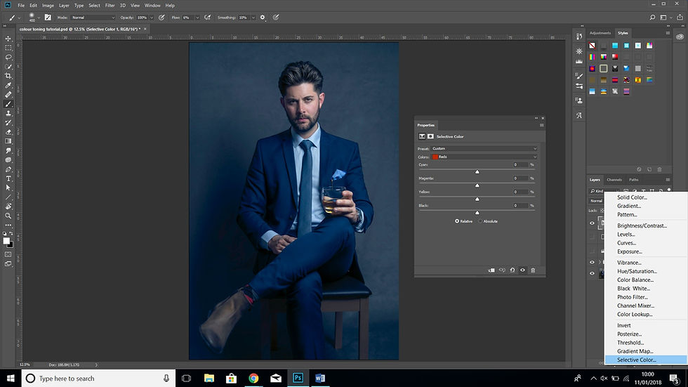
This is actually a fantastic way to colour tone but I feel maybe not many people actually use this method. Usually it is used for things like skin tone adjustments and overall colour correction.
In fact I used this particular method to colour tone while editing my most recent shoot. It does however give you options for adjusting blacks, neutrals and whites. Click the colours drop down box and they are the bottom three options.


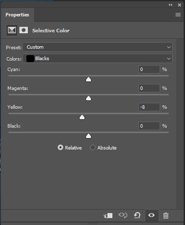
With this the important thing to know is the direct opposite of cyan, magenta, yellow (CMY) is red, green, blue (RGB). So for example you can add in more cyan, but, if you take away cyan you add red. The black slider add or takes away black. Working with the CMYBK colours you can add a hue to the above 3 by playing with the sliders and making it brighter or darker. Work with the blacks, neutral and white to get your desired effect.
2. Curves
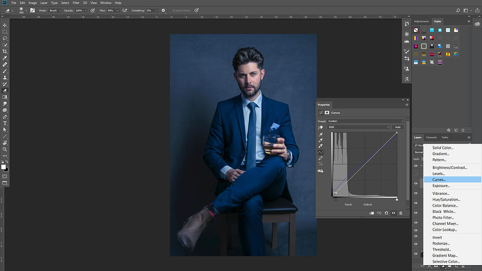
Again mainly used for a different reason other than colour toning. Usually used to control lights and darks within a picture. But if you select the reds, greens or blues and bring the bottom anchor point of the curve directly up then the shadows take on that colours hue..... Take it right and the opposite colour is applied. So an example would be up blue then to the right yellow, a yellow is the direct opposite of blue. Adversely take the top anchor point of the curve down the highlights get affected and left the opposite colour for the highlights. Add in a few anchor points in the middle to get your desired effect.

3. Levels

This tool is much like curves and normally used for a very similar reason, it's just set out differently. Rather than having a curve you have histogram with sliders underneath to control the shadows, midtones and highlights to make these more prominent. The bar underneath that will clip the blacks and the whites to lessen either. Here the drop down which say RGB you can change this to just red or green or blue to do colour toning.
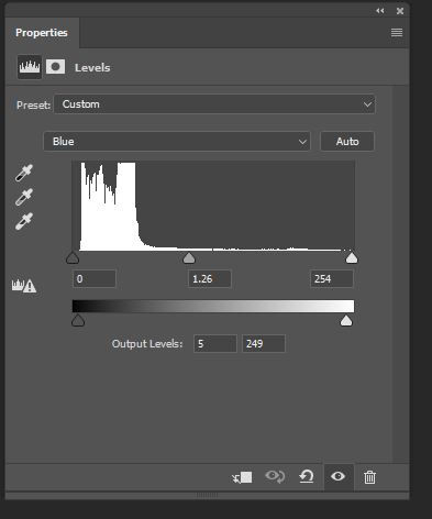
Now all these sliders affects colour. In the above instance I'm working on blues. So the left slider of the bottom bar adds blue to the shadows and the right slider adds yellow to the highlights. On the histogram sliders the left slider adds yellow to shadows and blue to highlights. The middle slider controls midtones, left blue right yellow. With all these sliders it can get a bit confusing. Personally I'm not sure I like this option a much a the others. Extra work using a layer mask is needed.
4. Gradient Map

This is the most obvious one to go to. However it is probably the most difficult one to get right but the one that gives you unlimited control of the colours. It can be difficult to get the gradient correct straight away but just spend time making little adjustments of where the colours sit on the tonal scale and how much the colours blend into each other. When done correctly this definitely is the most professional way to colour tone.

Here to try to get the same result a the rest I had 6 colour points on the gradient scale. From black, very dark blue, navy, royal blue, cornflower white, white. Then I dropped the opacity to 46% and fill to 40%. The blend mode of the layer I changed to lighten.
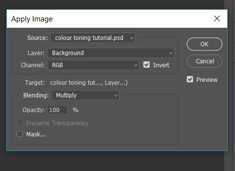
5. Solid Colour with apply image on mask.

This way does require extra work but is a clever way to colour tone but it will seem complex to anyone new to Photoshop. When you first add the layer you get the colour select tool and that selected colour covers the whole of the picture.

To start to get the image coming through you want to select the layer mask, go to the top menu click 'image' and go down to 'apply image'. there are a few things to select here. First put the layer as 'background', next put blending to 'multiply' (you can experiment with these see which works best for your image), finally depending on whether you want to affect the shadows or highlights you may need to tick the invert checkbox - tick to affect shadows, leave unticked to affect highlights. You will probably have to do this multiple times as it is subtle. With each additional time it will have less of an effect on the shadows or the highlights depending on what you choose.


Finally the last few things to do here are to reduce the 'opacity' and 'fill' of the layer and I personally change the layer blend mode to 'colour'. Even now you will probably see that the colour is still affecting the blacks and the whites a bit too much so you may have to do "blend if". By double clicking on the layer it will bring up the 'layer style' box. Under blending options you will see blend if. It is the bottom 'underlaying layer' you want to work with. This will enable you control to protect certain levels of dark or light tones. Holding ALT (windows) or Option (on MAC) and pressing the slider will split it in two and give you feathering on protected areas.


So those are the methods and here are the end results next to each other to see. I have colour calibrated my screen and they all look pretty close to each other. Click on the photo to see which photo used which method. Whichever you prefer you will get a good result.


Comments